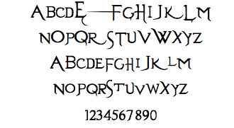
I quite like this font to be used in the opening sequence of the thriller as it is bold yet mysterious, it has a slight curl to it which could suggests that everything isn't as it seems and there is something 'hidden' behind the corner.
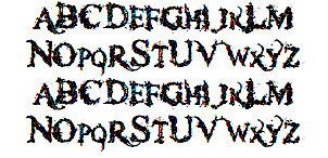
This font looks slightly like blood splattered which i like a lot as is gives a clue as to what the opening sequence is about. It is a little cliche for a thriller but i think it would fit into our story very well but without giving too much away.
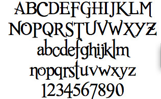
This font is similar to the first font but slightly more sophisticated, this text is quite sharp and pointed which gives off an impression that the sequence will be slightly gory.
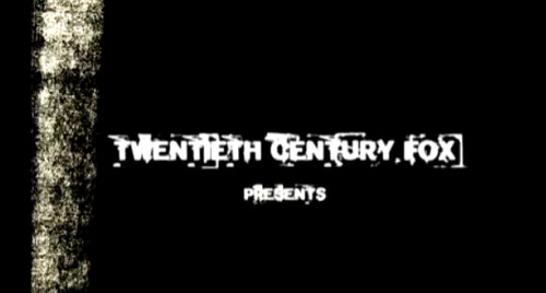
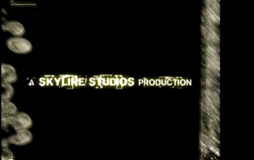
I found this font from an opening sequence on YouTube, this font looks very creepy. I like the way the writing is very square and the white blobs almost make the writing hard to read which makes the viewer pay more attention to the screen. On the video it blurs in and out which I had already imagined our group doing with some writing in the sequence as it would fit in well in the lead up to the cellar scene, this would link to the candle/lantern we are going to use which will be flickering. The stripe down the side looks similar to what the police use to identify finger prints which hints that something suspicious is going to happen which would also fit in with our sequence. This writing is my favourite so far.
No comments:
Post a Comment